“You have to kiss a lot of frogs before you find your prince.”
Well branding can be like that sometimes, too. You have to muddle through a lot of bad to get to the good. I have been busy with branding for several clients in recent months and am delighted to do so! It is one of my most favorite projects… I am either helping to announce the birth of a new company or freshening up something that’s been around awhile. Either way, I find branding to be both challenging and incredibly rewarding.
Logo design is one of the most challenging design jobs there is. It lacks heavy text or beautiful photography to fill the page. It must stand on its own. It must communicate and be successful, all by itself, without help from other things to “pretty it up”. This is no easy task, and typically requires a lot of trial and error (thus the kissing a lot of frogs reference).
A recent client, AgLand Market, is a new local business that is growing in leaps and bounds. They desired a clean, modern look that heavily relates to agriculture in style, color and graphics. They sell farmland, and are very good at it. It is as simple as that. All that I knew going into it was that they were drawn to primary colors, traditional farm imagery, and I was the 3rd designer to give it a shot… good thing I was up for the challenge!
Disclaimer: The images below represent only 3 of about 12 total proofs that were presented during this project. I chose the images with the most noticeable design edits, to demonstrate the process.
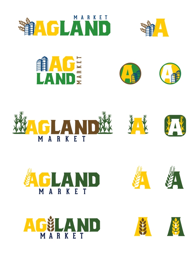
Round #1
Objective: Primary colors, traditional farm imagery, simple but bold font (they had already fallen for this thick block style), plus an icon for social media and web use.
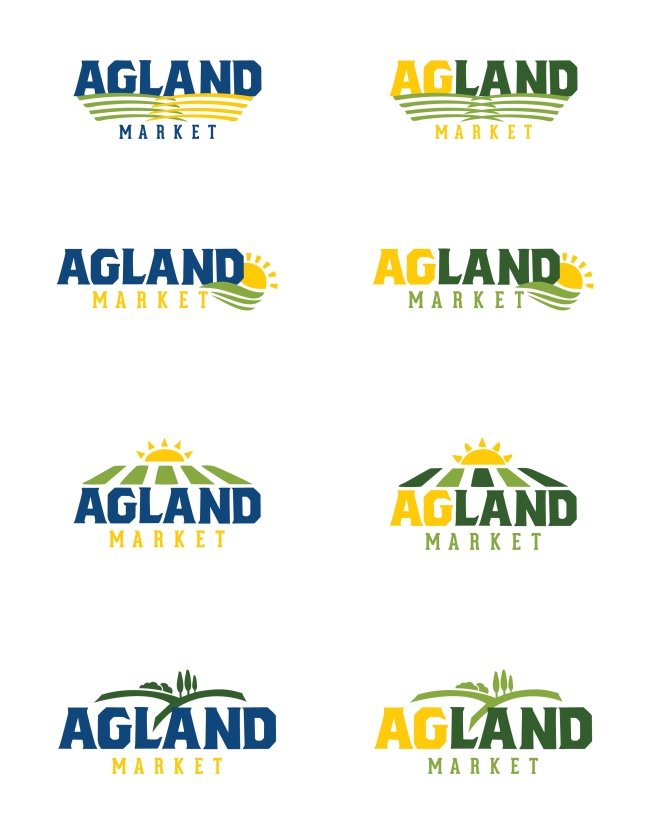
Round #2
Objective: Focus more on land (not crops) since that is what they sell, and lose the brown in order to stick with primary colors that are typically seen in this industry (yellow, green, blue).
Round #3
Objective: Simplify, simplify, simplify. Oh, and maybe try a gradient.

Done. We had to kiss a lot of frogs, but they found their prince (and I am pretty pleased with it, too)! Now it’s time for a letterhead, business card and outdoor signage… what, you thought we were done?
